


Gossamer Hollow, LLC and Coffin Critters are undergoing a minor makeover! In the upcoming few months, my shops will have an all-new look, including better photos and new pricing to reflect insurance on all packages delivered to the US!
My new Gossamer Hollow logo has been designed, and will be revealed during my Etsy shop Grand Re-openings. However, I'd love to have your opinions on the new Coffin Critters logo!
WHAT'S IN IT FOR YOU?
All votes will be entered to receive a free Graveyard Skull Dust Bottle, in your choice of colors. Leave a comment here with your favorite logo option and why you like it, and you will be entered into the drawing. One winner will be drawn at random November 1st.
Thanks for your help and good luck!
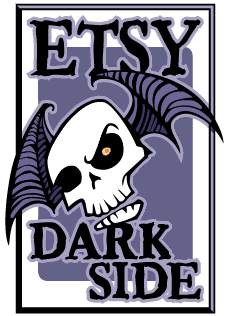
Your options are:
Sunday, October 17, 2010
New Logo, NEW CONTEST!
Posted by faerydustpixy at 5:10 PM
Subscribe to:
Post Comments (Atom)


12 comments:
I like #1 cuz it has a Critter in a coffin and just the right amount of color (red)
earthdancedaph@yahoo.com
Thanks, Daph! I had that same Critter in my previous logo, just simplified it a bit. I appreciate your input!
Option #2 is very good. I like it a lot. Graphicly it's very well done, and though I dearly loves your coffin critters I think that someone who doesn't know what the drawing is of might be confused by the drawing of them. Also, although that was the start to your shop your now expanding your product line in new ways. Option 2 reflects that expansion and doesn't pigeon hole you. Though I completely understand if you want to stay with the critters cuz that's what you started with, and its the name of your shop. Tough decision.
I'm going with #2. It just popped out for me it was a little cleaner and if I saw that logo I would definitely want to know what was attached to it. :)
I'm torn, because number 1 expresses what style of things you make but the image is a little too distorted for anyone to really "get it" so I'm thinking a cleaner, more artsy drawing or painting would do better for it. I've seen your drawing/painting skills, I think you should use them to create something cleaner with more visual interest and then scan the image into your computer. I do like number 2 as well, it is nicer and cleaner looking but it also doesn't show who you are as an artist either. It's a little too "every random goth artist" looking. It could be anyones, but with your name on it. So I don't know darlin'. Call me difficult :) Part of me wishes you'd work on that picture and really wow that logo up because I know you can do it :)
*changed my comment due to a typo :)
Hey, lady! I think option 2. It looks more like a professinal business logo. It's cleaner and the skull is eye-catching :)
Thanks, everyone! I did add one more option, Option 4. Same critter, different coffin!
I like the skull! For some reason with the skull my eyes are drawn right to the shop name.
There are some great comments and ideas here! I think I am starting to get an idea of what direction I will go in. But the contest is still going on, so feel free to keep voting!
I love option 4. It has my favorite color red & I think it makes your logo pop & stand out more! Also, I think to fit your logo best for Coffin Critters, it is better is the coffin is open. =)
I like option number 3 because it is different that all the rest. Skulls tend to draw people to look at things or look at shops!
Post a Comment